Southwest Airlines
How do you launch an airline in a new city that in many ways is the antithesis of that cities hometown airline? You embrace the difference you have to offer. For Southwest, that difference is all in its personality, accessibility and vibrance. At the time of launch, Delta was embracing a black and white look and feel to bring an air of polish and elegance. We chose to break through that black and world with brilliant pops of color as more and more of Atlanta discovered the Southwest difference.
Click ‘N Save
With brands filling your inbox and adding to clutter, Southwest needed to offer an enticing reason to subscribe. Our goal was to create print that actually made people stop, dream and drool and question ‘How do I get there?!’ The simple graphic representation of clicking on mail showed how to get there in the simplest way without distracting from the beauty of the image.
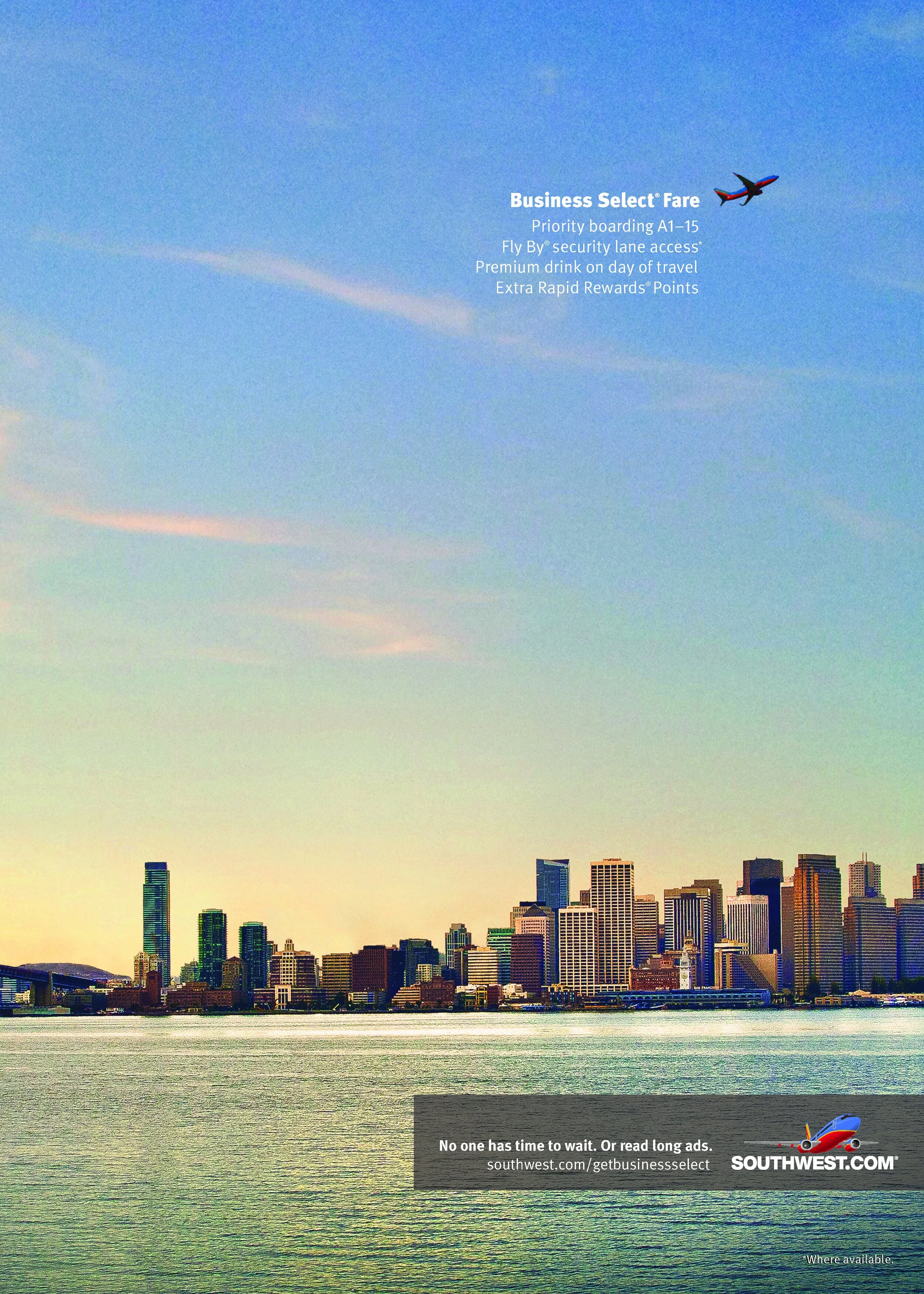
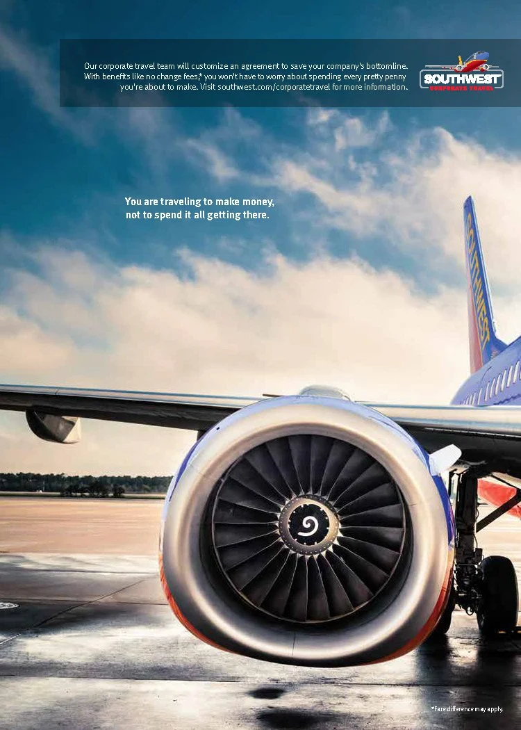
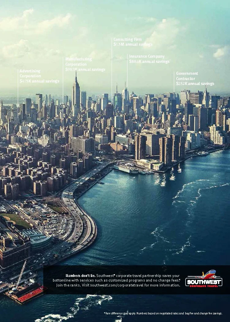
Southwest Business
At the same time Southwest was leaning into evolving their unique nature, they were also launching Corporate and Business travel programs. So how, in a category that has historically focused on status, do you convince businesses to travel a democratized airline? You make it about the bottomline.


